Editorial brand systems
Lola Magazine
Lola is an independent print and online magazine celebrating art and culture in Berlin from an outsider’s perspective. As founding Art Director I created the wordmark and built the design language around it, including a complex editorial system and marketing assets. I single-handedly designed the entirety of the first seven issues.
- Identity design
- Editorial design
- Art direction
- Marketing design
- Print production
- Role
- Founding Art Director
- Years
- 2016–2020
- Cadence
- Quarterly print
- Output
- 7 issues + launch system
Identity
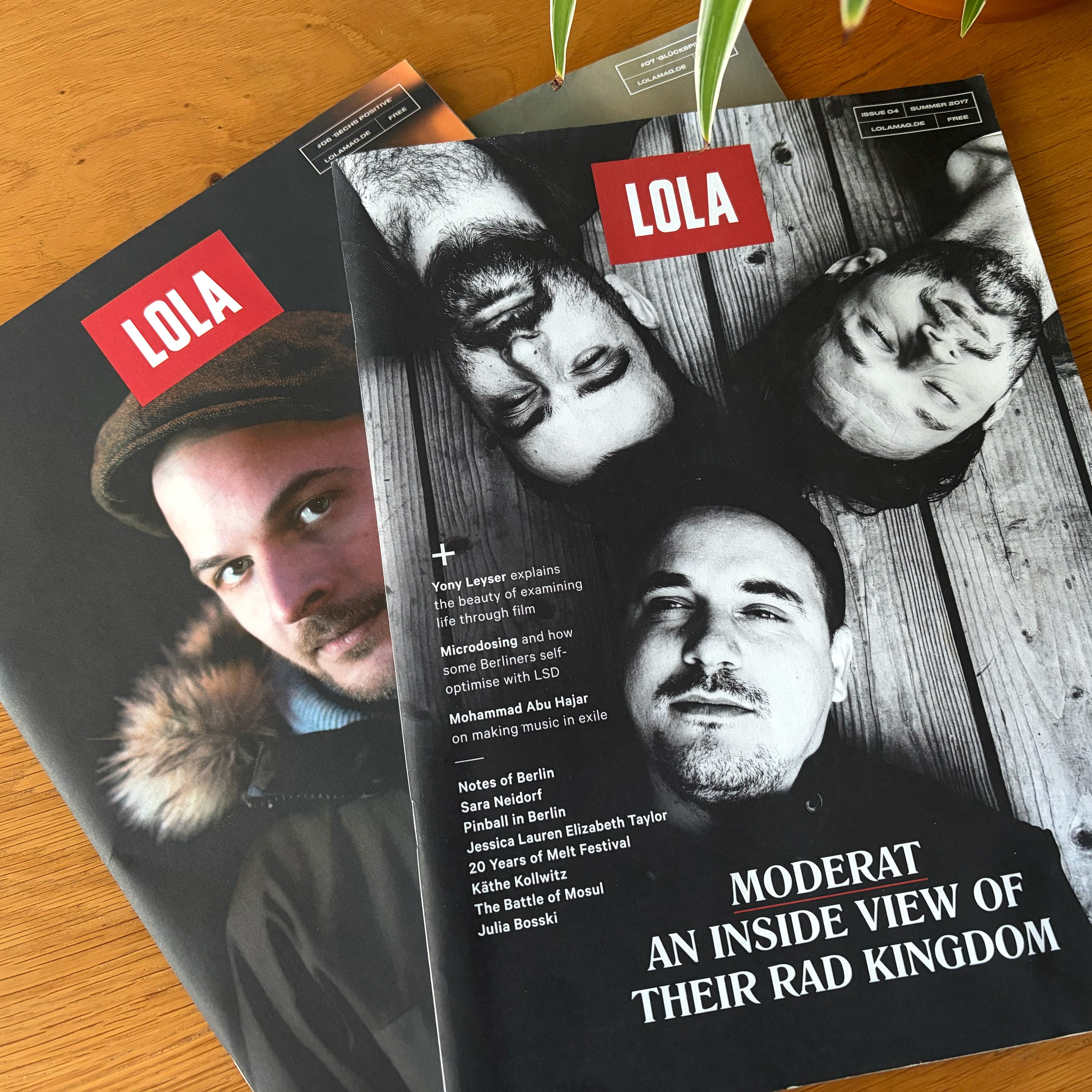
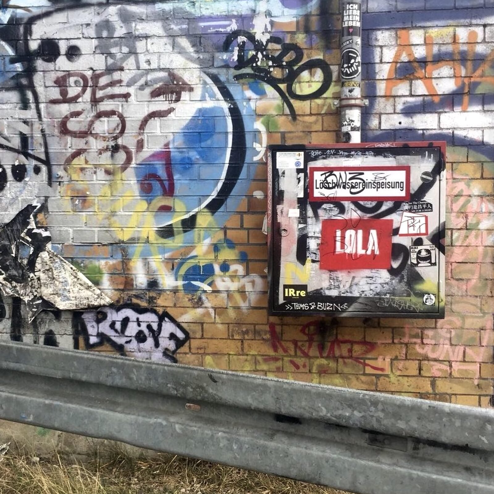
The identity for Lola is based around a few simple ingredients: a bold logo; a palette of red, black and white; a simple typographic system; and the decision to work only with the best local photographers. The logo holds at any scale — instantly recognisable on screen or sprayed on a wall across the street — and the palette and the type run unchanged through every spread, poster and social channel.
The Design System
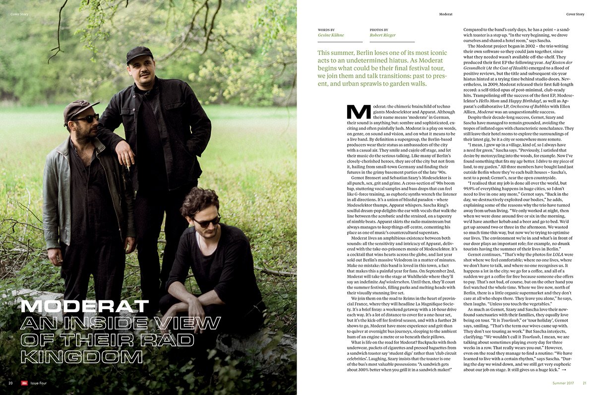
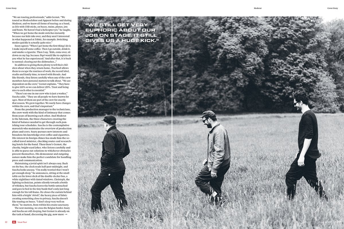
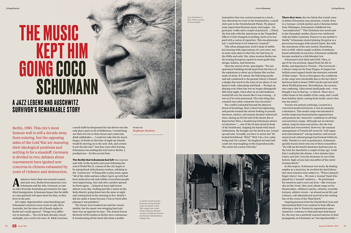
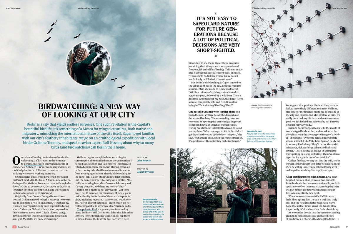
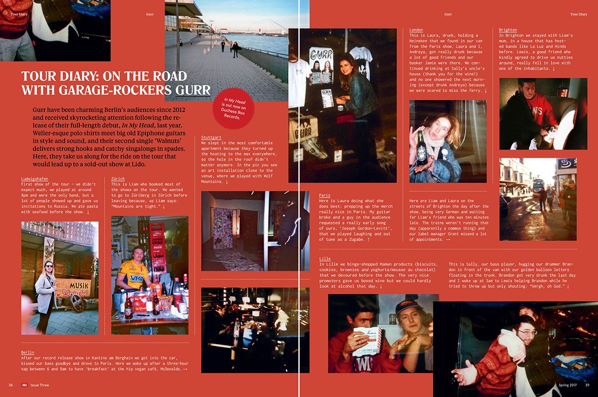
An editorial design system needs enough flexibility to cover a wide variety of content — features, listicles, photo spreads, columns and the standing pages (contents, masthead and the rest) — while still remaining coherent and logical throughout. At Lola, visual storytelling, pacing and restraint were key: images were given a lot of breathing room, and everything locked to a 10-column grid except when an injection of playfulness was needed to create visual interest and rhythm.
Behind the issue · Art directing an editorial project is more than just a complex visual design system — it's also a tightly timebound, often high-pressure project management role. Relationships with photographers (and their subjects), illustrators, print and delivery vendors, plus multiple rounds of proofing and corrections all need to be factored in.
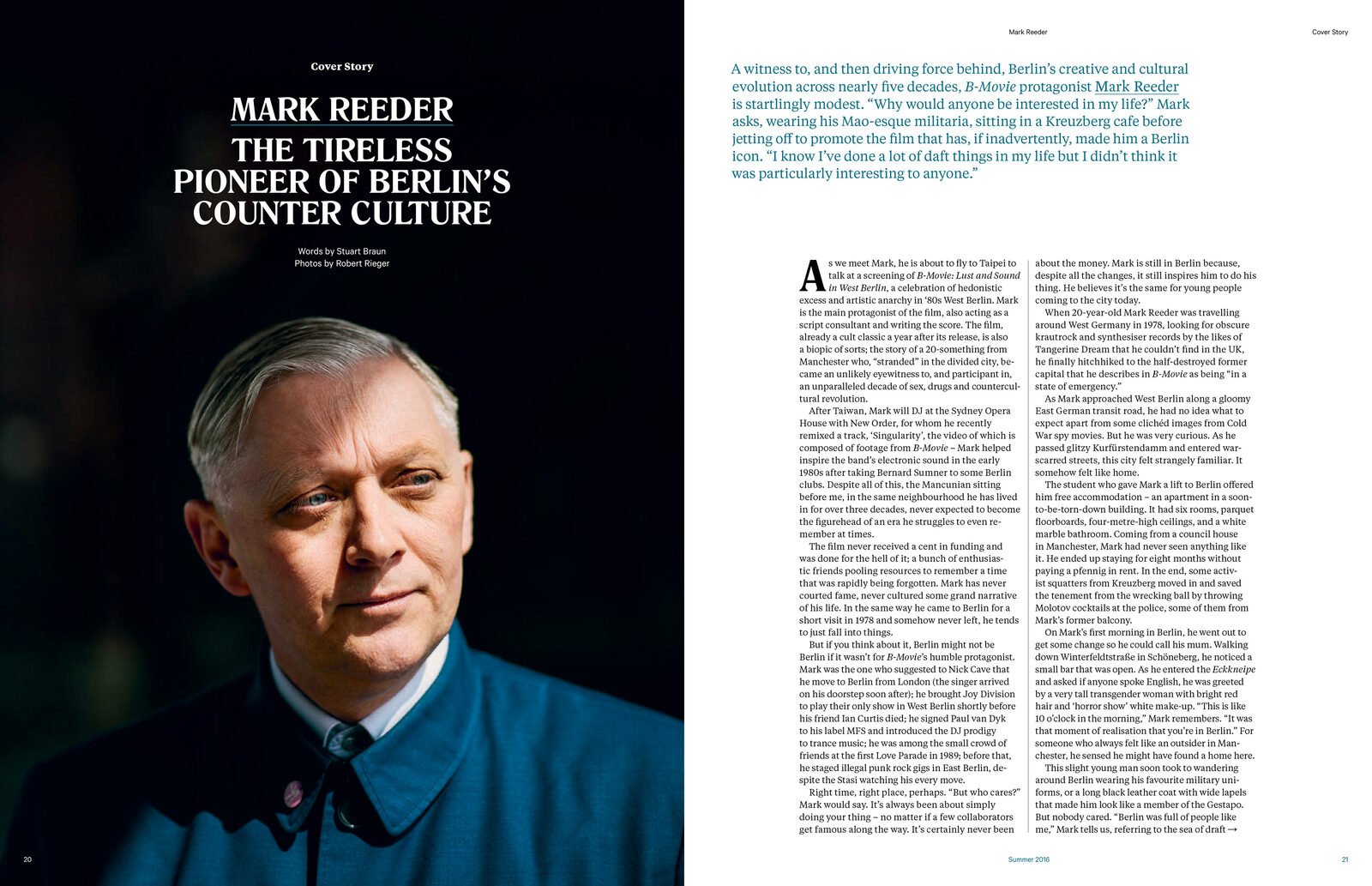
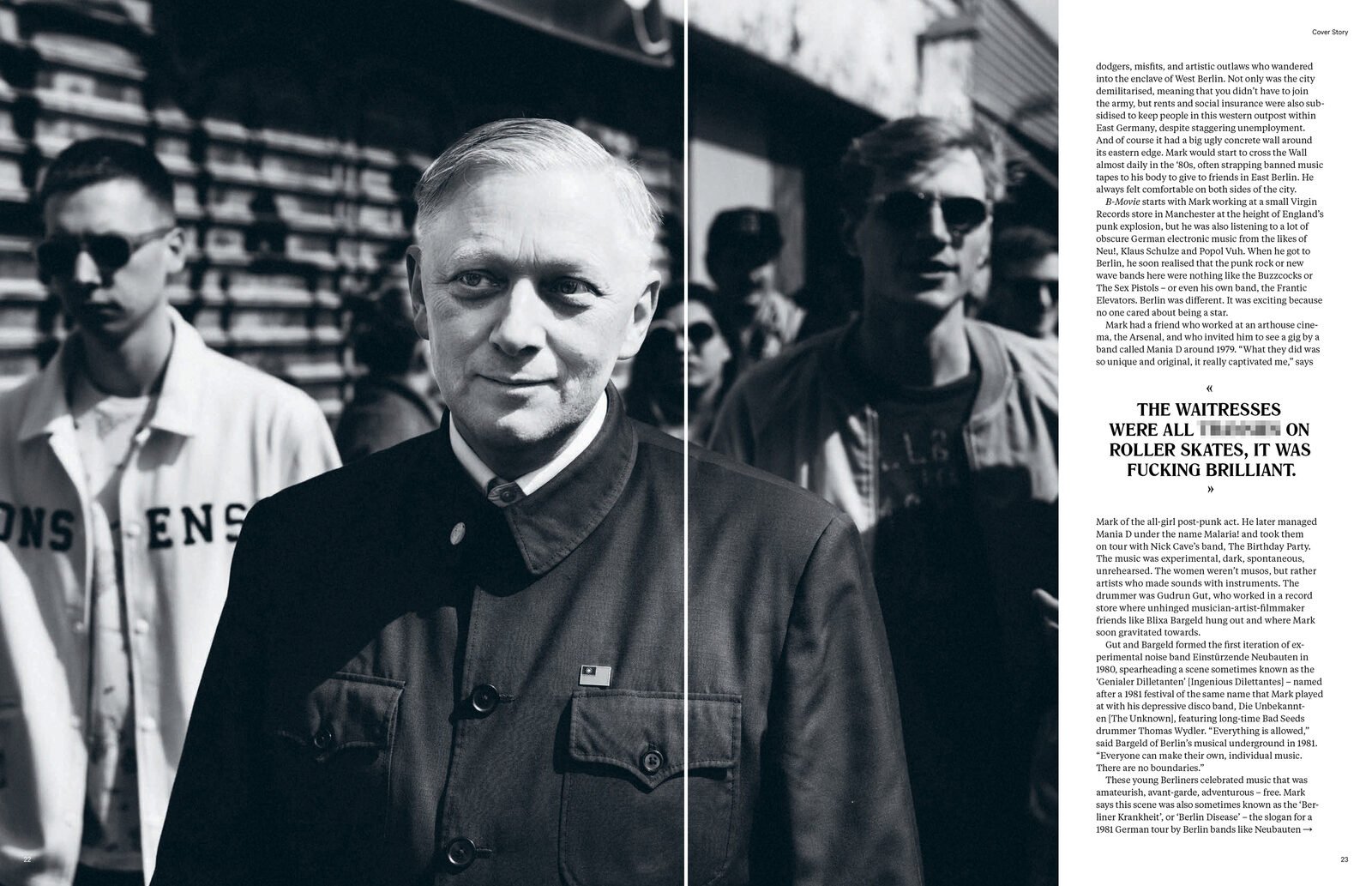
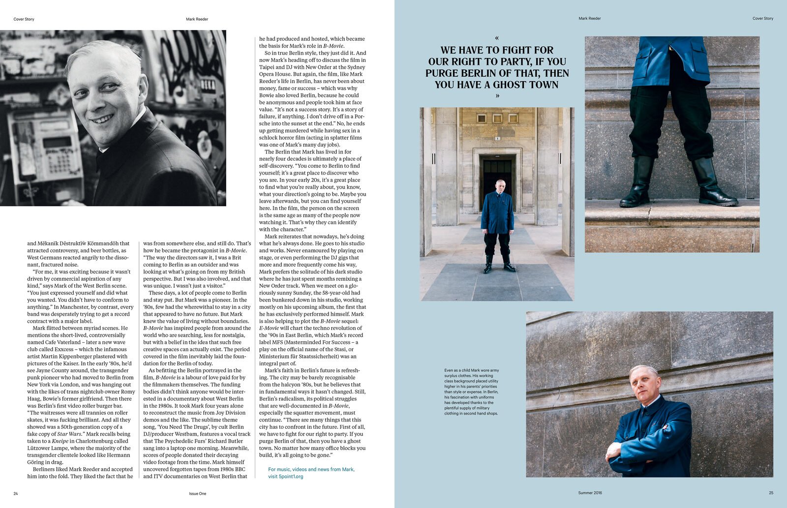
Spreads from issues 1–7

Off the page
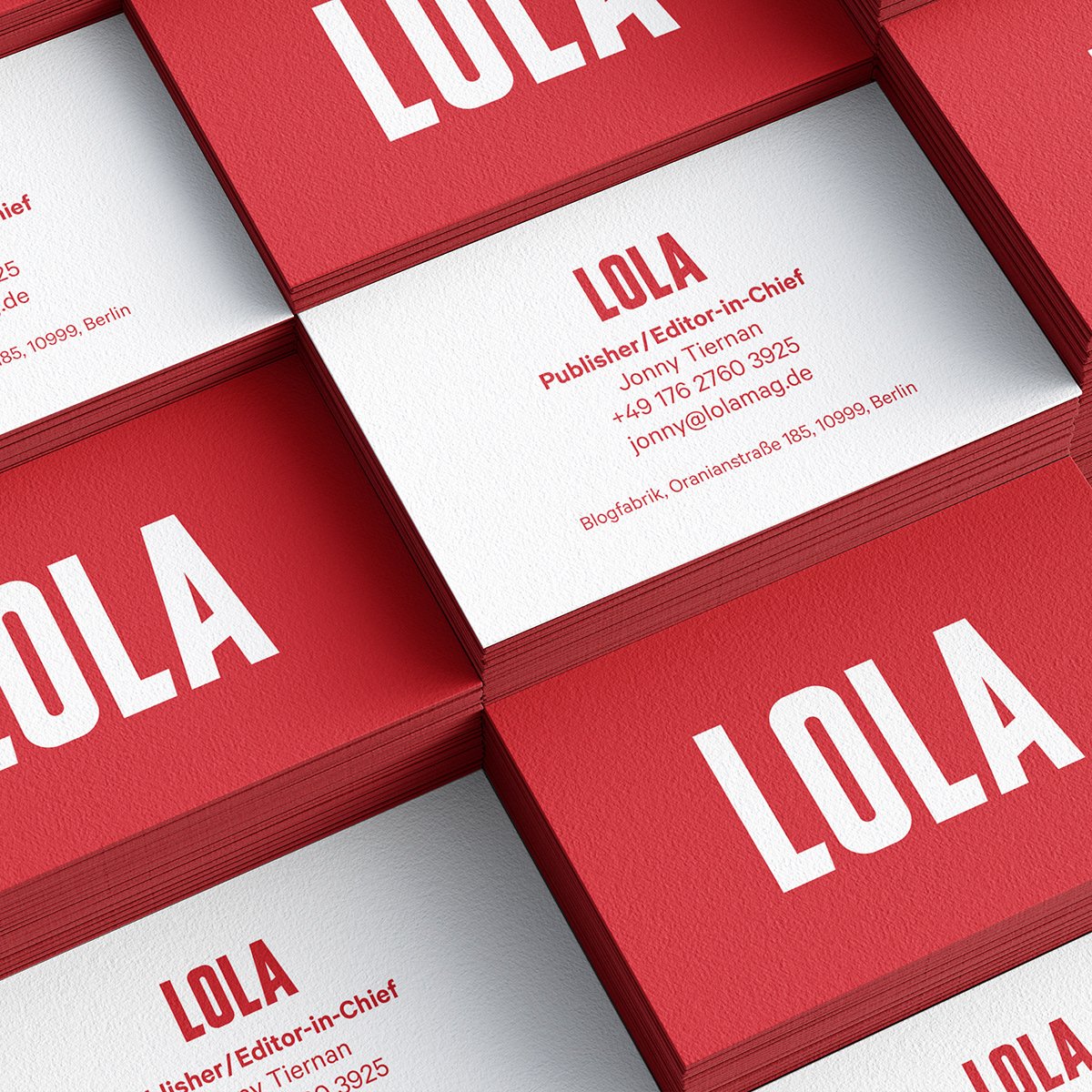
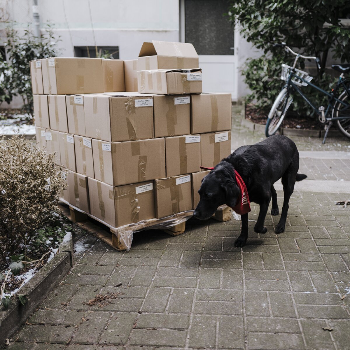
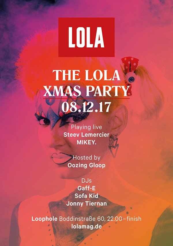
The launch kit and marketing materials emerged naturally from the design system. The wordmark sits inside its red box on the business cards, and drops the box on any other red surface without losing any impact — t-shirts, coffee mugs and even canine fashion accessories. Promotional material for the launch events allowed a bit more fun with a bolder approach to colour and imagery, without stepping beyond the brand system’s boundaries.
Outcome
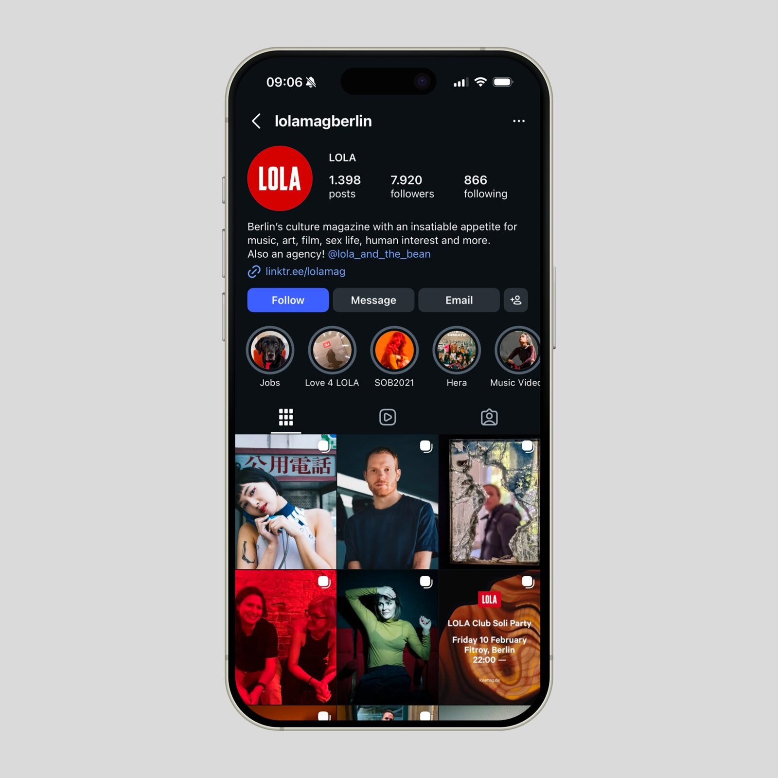
7 issues between 2016 and 2020, online and offline marketing materials, 8,000 followers on social channels and an identity still on the streets of Berlin today.
Next case study
Exberliner →Three years as Art Director at Berlin’s English-language city magazine — around 70% of each issue, the 2017 rebrand and a 15th-anniversary edition printed with spot metallic gold ink.